Parkmate
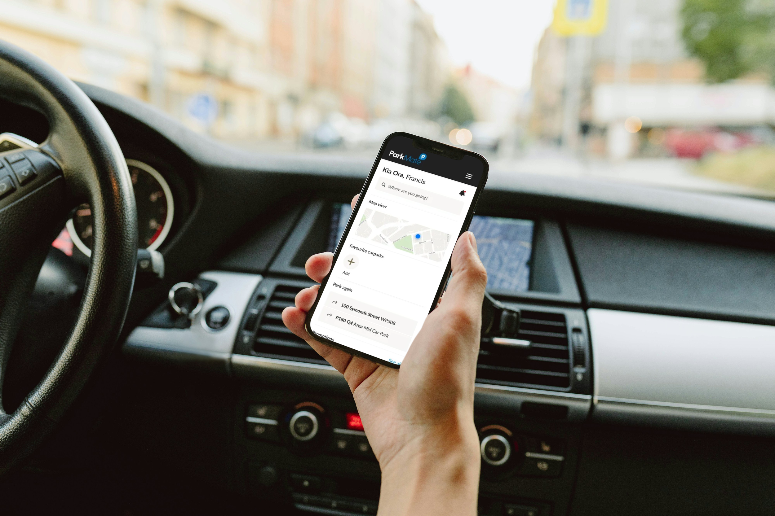
This case study delves into the redesign of ParkMate, New Zealand's most used parking app. The project focused on transforming the user experience and maintaining ParkMate's market leadership.
Project
Parkmate
Year
2021
Duration
3 months
Client
Wilson Parking
Team
Designer + Product Owner
Sector
Transportation
The achievement
Increased the App store rating from 1.9 stars to 4.5 stars
App Store star rating ⭐️
In a nutshell
-
ParkMate is a New Zealand app that allows users of Wilson Carparks (285 nationally) to locate and pay for parking. It eliminates the need for physical pay machines, allows users to top up parking, and cancel from anywhere at anytime. Parkmate offers both prepaid parking and casual parking, allowing users to pay as they go, ending it at any time and only paying for what they use. Other than the Auckland Council parking app, it is the most used parking app in New Zealand.
-
As the primary designer, my role encompassed a full-scale redesign of the app. I was responsible for comprehensive user research, competitive benchmarking, UI and accessibility audits, prototyping, and user testing.
-
Despite its widespread use, the app’s low user sentiment and functionality have highlighted a need to reconsider its user flows, logic, and processes. There was a significant dissatisfaction from users, primarily regarding it’s usability. Users were frequently getting parking tickets due to difficult UX patterns, or parking in the wrong carparks due to lack of geocoding. Users were turning back to physical pay machines, which was a problem as Wilsons was looking to phase them out of parking buildings.
-
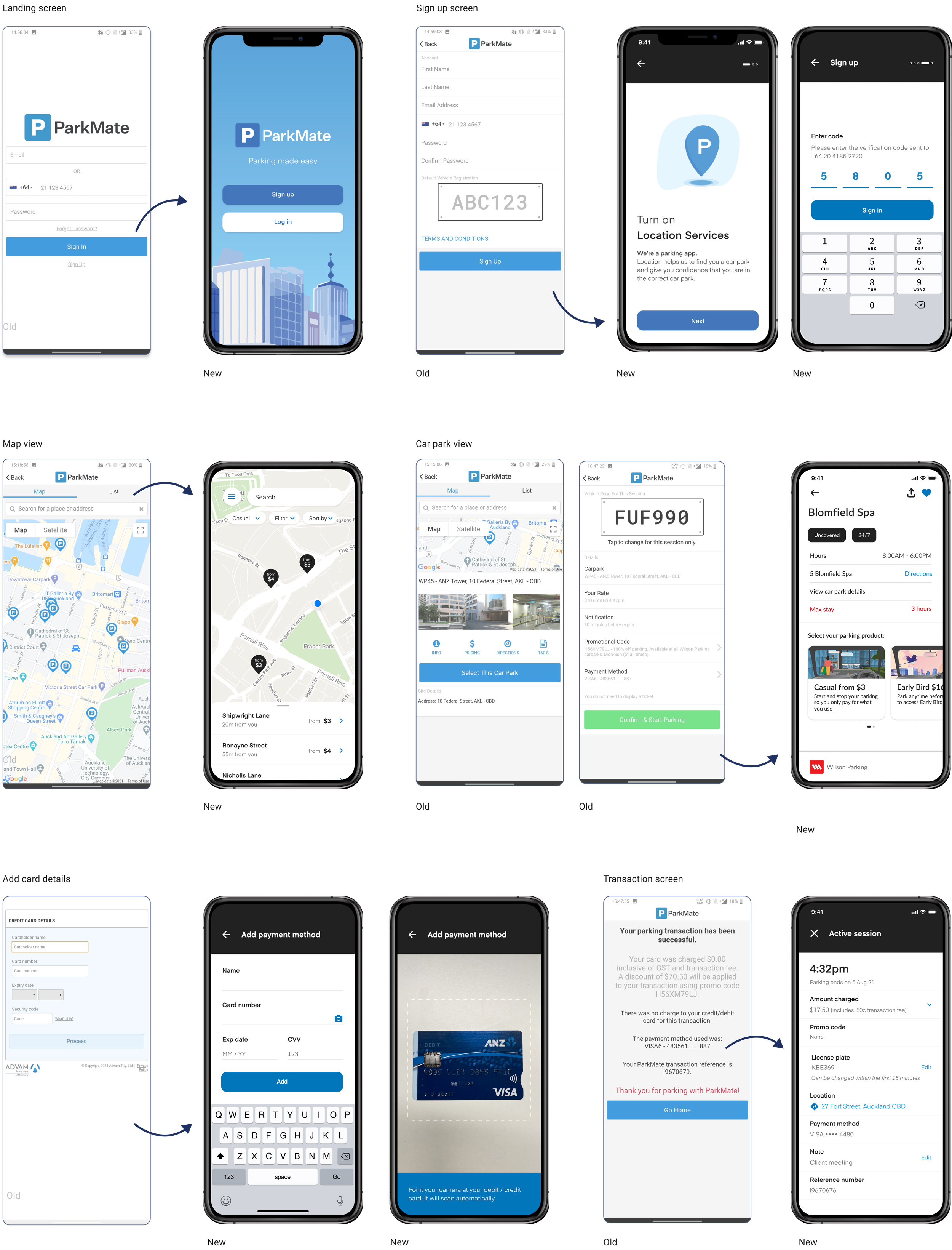
The redesigned ParkMate app offers a streamlined process for both pay-as-you-go and pre-paid parking, featuring quick onboarding, easy park location via favourites or proximity, and an updated, user-friendly visual design for straightforward navigation.
UX Research
Desk research
UI and Accessibility Audit
Synthesis and playback
Quantitative research
Moderated User Testing
Step 1
Desk research
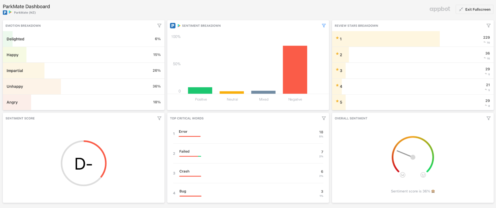
Initial desk research revealed a D- sentiment score for ParkMate, with critical feedback focusing on errors, crashes, and bugs. A detailed comparison with local competitors like AT Park and Parkable and global apps such as Honk, Just Park, and Parkme showed that ParkMate lagged in key features. The UI and accessibility audit uncovered inconsistencies in fonts, colors, and tone, adversely affecting the brand perception.
Step 2
UI and Accessibility review
My initial step was an audit of the existing app. I discovered significant inconsistencies, with 15 different font types and styles, erratic use of colour, and tone of voice, which were undermining the brand's reliability and user experience.
Step 4
Qual User Research - User testing
The objective is to identify pain points and understand behaviours in the ParkMate first time experience. For in-depth insights, I user-tested the current app with 7 first-time users in real-world scenarios. These sessions, each lasting 60 minutes, were split into understanding their parking habits and tasks using the app. This approach helped identify the initial friction points and areas of confusion, especially when finding the right car park.
“I’m getting a little frustrated”
“Doesn’t even have 2 stars, bummer.”
“It doesn’t make sense why I can’t search for it”
“What do I do now? Go home?!”
“It doesn’t tell me how it works”
“At this stage I’d probably just give up on the app”
Step 3
Quant User Research - Survey
I surveyed 16,000 ParkMate users with varying engagement levels.
The survey included 10 targeted questions designed to uncover distinct usage patterns and preferences. The aim was to achieve a 10% response rate for statistical significance. This research was pivotal in understanding both high and low engagement users' behaviours and motivations.
Users didn’t understand the value proposition
Users felt frustrated by the length of time needed to sign up
Users felt confused that they couldn’t search for a location
Users felt impatient with entry of credit card details and unknown payment screen
Users experience confusion with inconsistent UI components
Key findings
When participants were asked to download the app, some felt compelled to investigate further after not understanding the purpose of the app from the app store.
Those participants went on to Google and the ParkMate website to find out more. At that point, they said they would have given up if they were in a real life situation.
On sign up, some users felt frustrated that they were required to sign up immediately and expressed they would prefer to skip or be able to use a guest log in. They were more likely to use the parking machine as it would be a faster process than sign up, especially if they were in a rush.
When users were asked how they might locate a car park near Spark Arena, nearly all users searched “Spark Arena” in the map expecting to see the address. This is due to an existing pattern in Google Maps whereby searching a place name, it displays the address.
Some users left the app to either google the address or search it in Google Maps, whereas some users decided to zoom out to locate the venue on the map. These users said if they weren’t familiar with the area they would have left the app to search for the address.
Users expressed that they were suspicious of the payment screen as they did not recognise the branding and thought they had been taken to another site to complete. This caused users to feel uncomfortable proceeding with entering their details.
Some participants felt impatient when adding their credit card details as they expected the experience to be automated via photo recognition.
They also expressed in the case where they were in a rush it would be frustrating and quicker for them to pay at the machine.
At current, the ParkMate UI has inconsistencies that cause users cognitive overload and results in them having to learn the interface on every screen.
There are roughly 15 font types that creates inconsistency for users and there is a double of icons uses.
At current the colour contrast ratios do not meet accessibility. Currently some of the colour combinations used fail in this area.
Recommendation
Updating the images in the app store to better communicate the value proposition of ParkMate. Utilising the images to preview the main JTBD will help users to understand the value proposition and encourage adoption of the app.
Allow social sign up for users. Using existing log in information from a social network provider like Facebook or Google, the user can sign into ParkMate instead of creating a new account. This simplifies registration and log in for users and will ensure users can sign up to the app quicker especially while they’re on the go.
Consider integrating PoI GeoCoding so users aren’t restricted to only searching for locations by address. This will reduce drop off caused by users needing to leave the app to find an address or use other map apps to find their destination. This will ensure users can complete their JTBD quicker especially while they’re on the go.
Consider customising the payment entry screen to reflect the ParkMate branding in order to reduce the confusion expressed by users when presented with this page.
Consider integrating ApplePay into the payment process as this is an experience that users expect and are comfortable with. This will ensure users can complete their JTBD quicker as it is a simple step that they trust.
Consider adding photo recognition on the credit card entry screen so users can efficiently add their credit card. This will ensure users can complete their JTBD quicker especially while they’re on the go.
Implement a UI Kit that ensures the app meets minimum accessibility requirements so that all users are able to use it successfully. Testing the app with users who have specific accessibility needs, or getting expert advice from an accessibility expert. This would ensure the app works for every customer, no matter their needs.
Consider a design system that ensures that there is consistency throughout the experience for users and they are not experiencing any cognitive overload with new UI experiences between screens.
UI Design
UI Kit
Design studio Workshop
User testing
Final designs + Handover
Recommendations to client
Rapid low-fi wireframing
High-fi prototyping
Step 1
Rapid low-fi prototyping
I facilitated a Design Studio workshop with various RUSH employees, building on the 'How Might We' (HMW) questions identified in the research phase. The workshop included three rounds of Crazy 8’s brainstorming, followed by a series of exercises to refine our ideas and concepts.
Step 2
Test plan and moderated user testing
Post-workshop, we gathered all the design ideas into a Miro board for synthesis. This allowed us to quickly develop low-fidelity prototypes, efficiently discerning which concepts were viable and which could be set aside. This process streamlined our focus towards the most promising designs.
Step 3
High-fi prototyping
Building on the insights from our low-fidelity prototypes, we progressed to creating high-fidelity prototypes. This phase involved detailed design work, where we focused on refining the user interface, incorporating realistic content, and ensuring a closer representation of the final product. These prototypes were instrumental in conducting user testing, providing valuable feedback on both the aesthetics and functionality of our design concepts.
Step 4
User testing
We user tested the new design with 8 users, the purpose being to test the usability of the proposed redesign of the ParkMate app in response to pain points identified in the original user testing.
Testing was run remotely using Askable to recruit 8 participants and run the usability tests. We shared a Figma prototype with participants and asked them to complete tasks similar to the initial user tests to ensure the redesign is an improvement on the current version
“That would be extremely handy”
“The way it is formatted is super simple”
“Oh this would be really helpful for me!”
“The design of this is quite nice too, adds that character to parking, gives it a personal touch”
User testing outcome
-
Test usability of product concept with target audience
Validate with real users what’s usable and to ensure we build the right thing + understand the “why” behind actions.
Compare user comprehension and confidence of the new experience with the current experience
Ensure the product concept is an improvement on the current concept.
Understand behaviours and interpretation of value propositions.
Ensure users can successfully complete their JTBD
Ensure users can successfully complete their main and secondary jobs to be done without friction
-
Enhanced user experience and intuitive interface
The redesign successfully enhanced user experience with intuitive sign-up, clear onboarding, and easy navigation, particularly in functionalities like map usage and payment methods.
Effective information presentation and functionality
Users positively received the clear presentation of essential information, such as parking locations, prices, and the benefits of features like number plate recognition.
Identification of areas for further improvement
While the redesign was largely successful, user feedback highlighted areas for further improvement, such as clarifying pricing details and providing options for personalising notifications and payment methods.
Wrap up
Recommendations
Hand over
Learnings
Recommendations
As part of wrapping up the project, along with the full Figma designs and prototypes, we wanted to outline all recommendations that we identified throughout the research. Some of which we wanted to highlight as high impact on their users, through to low impact. This was to guide them in prioritisation and decision making when it came to continuing to optimise the experience of their users.
-
Ensure users understand the key value prop of each permission upfront
Ensure product page is accessible from either the list/map view or using the search function
Ensure users can easily turn on number plate recognition and that the value is clear when they’re asked
Ensure that users are able to make an informed decision when selecting their preferred car park based on price or/and distance
-
Ensure users can easily enter their number plate and that it’s clearly communicated why it’s important
Consider including illustrations to help guide users and humanise the experience.
Ensure placement of the payment method button is located near the confirm & start parking CTA and is within the green thumb zone
Ensure users are able to enter their payment details from the product page
Ensure that the purpose of the max stay slider is communicated with clear copy below
Ensure that it is clearly communicated with design and copy that early bird sessions cannot be stopped or paused once they have begun
-
Consider conveying to users that they can edit their notification preferences later
Consider implementing the ability for users to nickname their payments
Ensure that users are able to enter a reference/note when starting a parking session
Handover
The nature of working at a services company, is that sometimes clients will come to us with a pre-existing relationship with a dev house, usually off-shore. In this case, we conducted a handover of the project with both their external development team, and internal design team. We ensured that the project files were easily transferable and all designs were marked up for the developers.
Learnings
Parkmate was a really engaging project, though it wasn't without its challenges. One of the main issues we faced was the client’s tendency to introduce new constraints and requirements without prior discussion with our team. This started pushing the project beyond the initially agreed timeline. The complication here was that both the product owner and I were scheduled to move onto another project by the end date. As a result, when it was time to wrap up Parkmate, we had to hand over our work to the client’s internal graphic designer to address these last-minute changes. While this shift meant that the final version of the app wasn’t as polished as we’d have hoped, we did our best to support the graphic designer throughout this transition.
Looking back on this project, if there's one aspect I’d reconsider, it would be the app's UI. I’d relish the chance to go back and refine the use of illustrations and the layout of the product and purchasing screens. This project dates back to 2021 when I was working at an intermediate level. Reflecting on it now, I’m quite proud of what my younger self accomplished, but I also see clear opportunities for enhancing the UI and visual identity.


